— WHAT I DID
Content strategy
UX audit
User journeys
IA & content hierarchies
Design workshops & card sorting exercises
— TOOLS
Figma
Excel
User testing & behavioral reports via our research team
— FOR HOW LONG
3 months
xfinity features hub
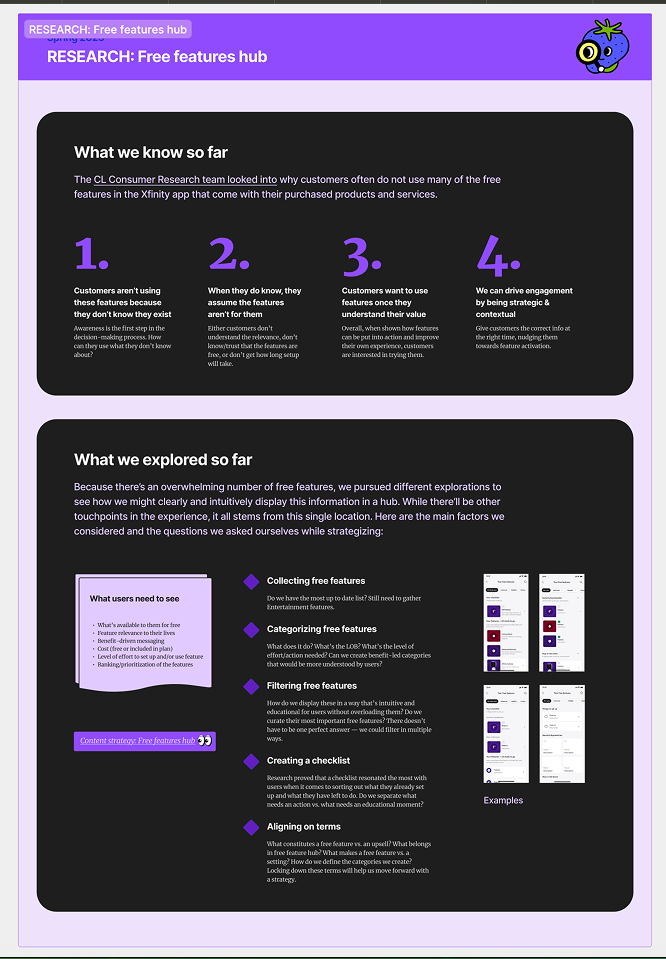
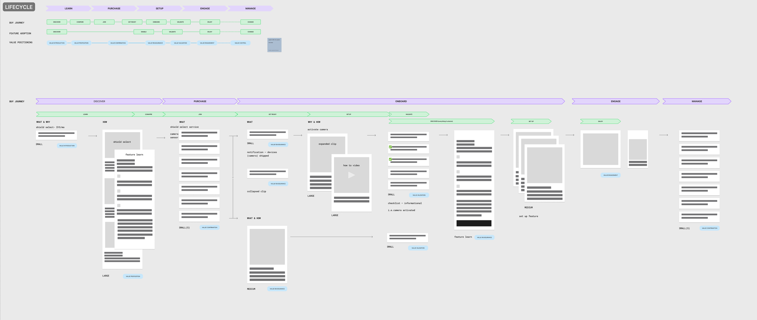
As a way to address the lack of Xfinity customers setting up and using the free features available to them within the app, I was tasked with auditing how our various teams & lines of business display feature adoption — in order to create an intuitive and educational hub for all features to live.

gathering the list
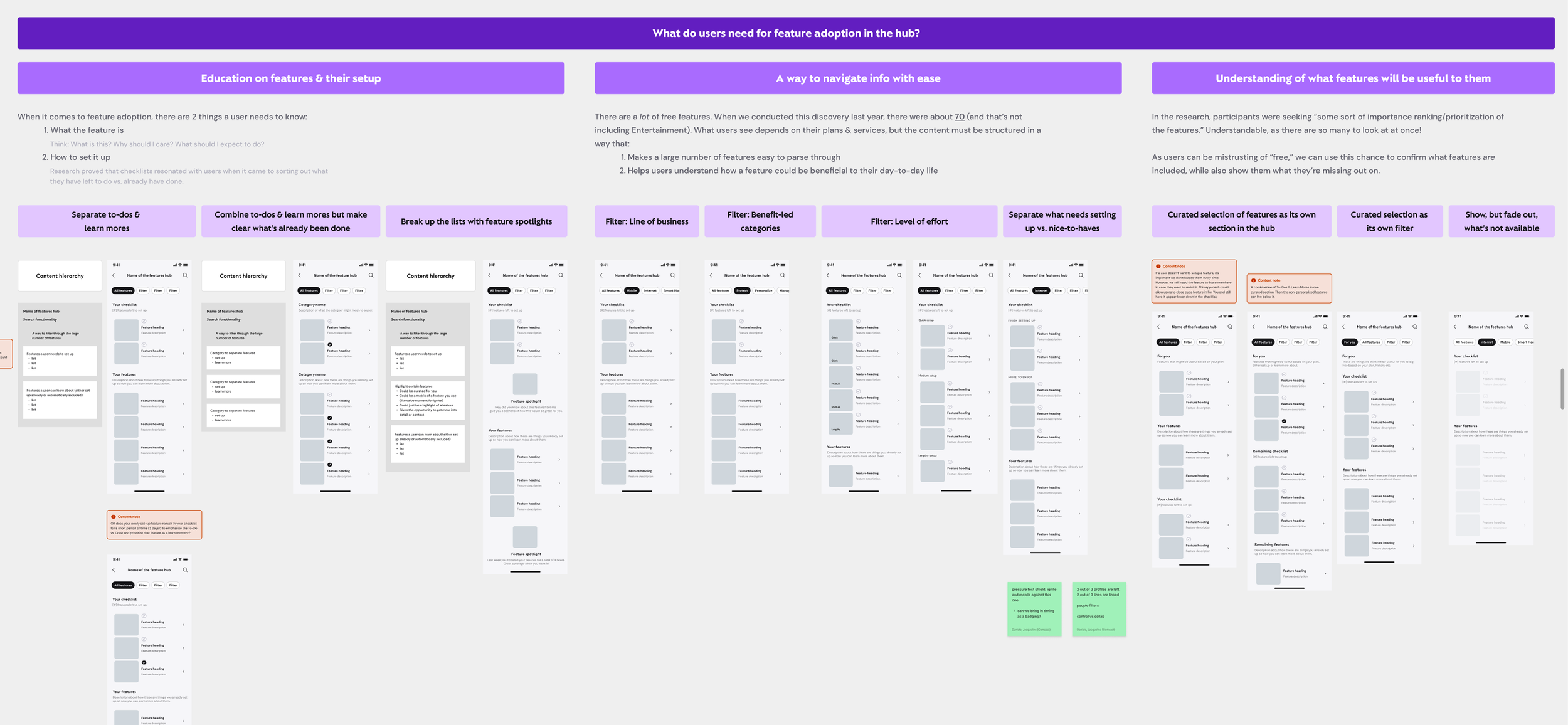
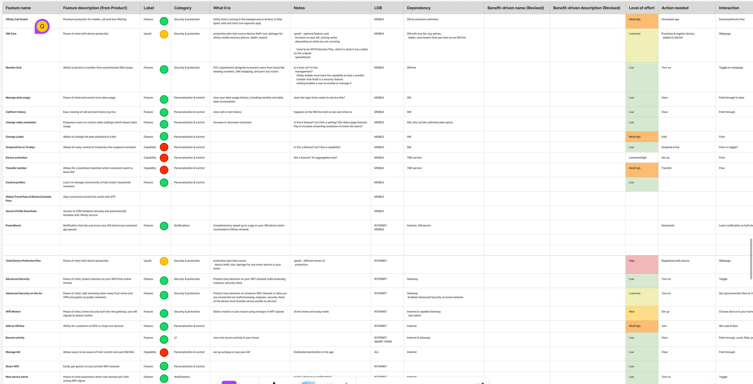
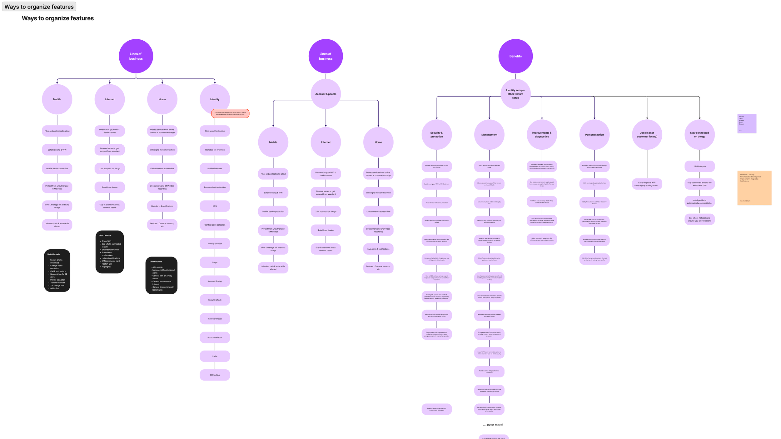
It all began by compiling the list of 70+ free features available to customers. Initially, the list contained Xfinity-branded terms and little information about what’s actually in it for the user. After more discussions with Product and Design, I was able to capture many angles we could use to organize this long list and create value-led messaging.
shaping the strategy
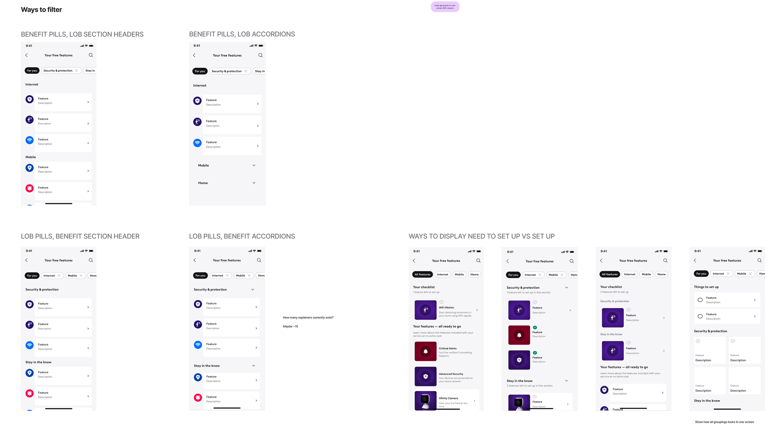
In collaboration with the research team, I used customer surveys, decision-making consumer reports, and prototype testing to shape the different content strategy approaches to grouping and communicating this long list of information.
aligning with the teams
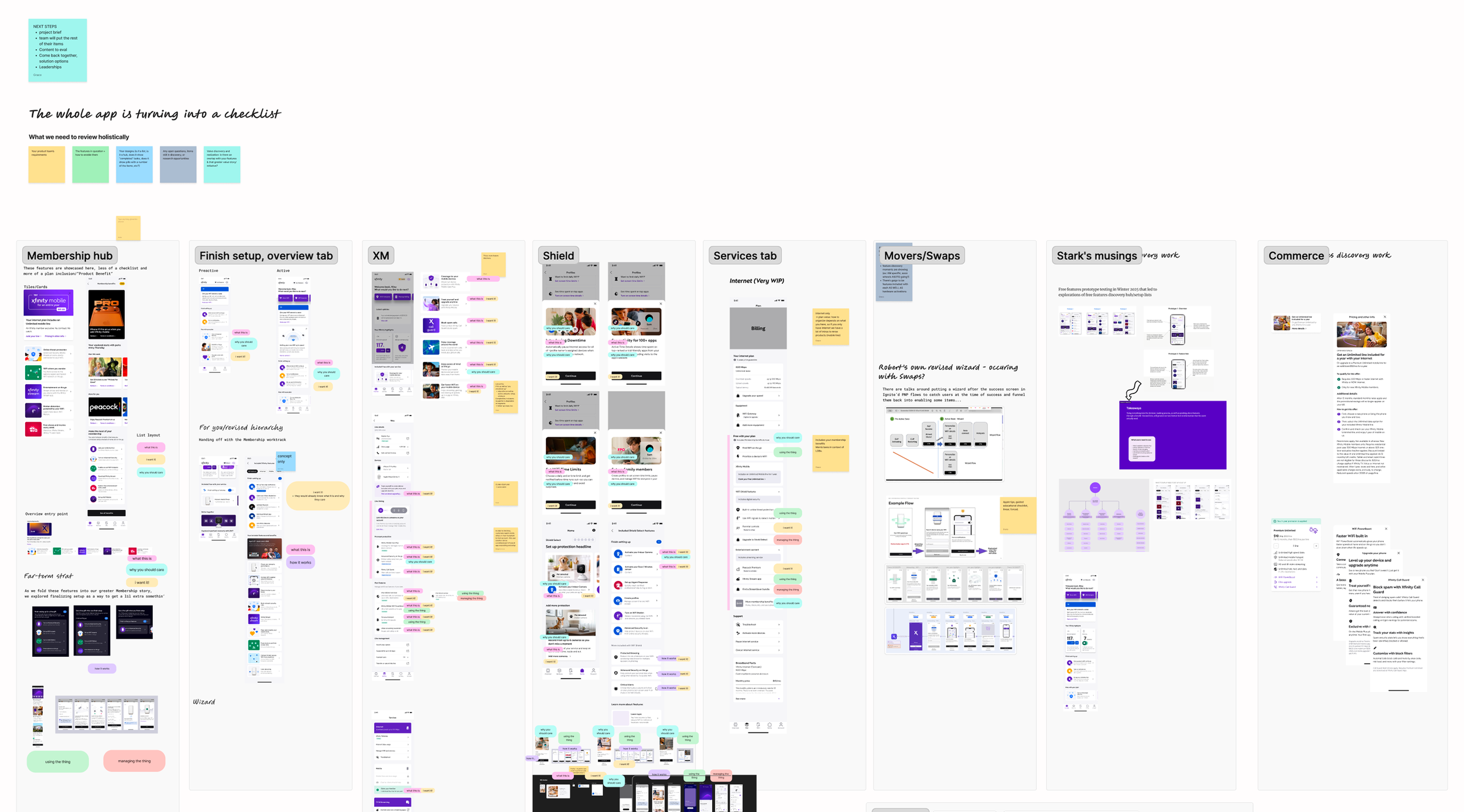
We realized that across Xfinity Mobile, WiFi, Smart Home, etc., each team was making different versions of the same feature lists in the app. Through workshops, we reviewed everything that currently exists, how we can standardize a framework for all, and where the nuances between each services are.
delivering direction
After documenting user needs and business priorities regarding feature adoption, I presented a variety of approaches to structuring and organizing the feature hub to leadership of these teams. They pressure tested their favorite options on their own work and found a strategy that works for every service in the app. This new feature hub will launch later in the year.