
— WHAT I DID
Content strategy & hierarchies
IA & wireframes
Content development
UX matrix for all of the permutations
Extensive dev specs
Rounds of legal approval
— TOOLS
Figma
— FOR HOW LONG
6 months
xfinity mobile trade-in
One of the most complex projects I led at Comcast was for a net new in-app experience for customers trading in their phones, tablets, and smart watches to get credit towards a new purchase. 36% of all Xfinity Mobile customers trade in their devices, and this experience is able to address 22% of all failed trade-ins that aren’t related to a customer sending in a damaged device. Those are big numbers that, until now, didn’t have a place to follow the trade-in process all in one spot.
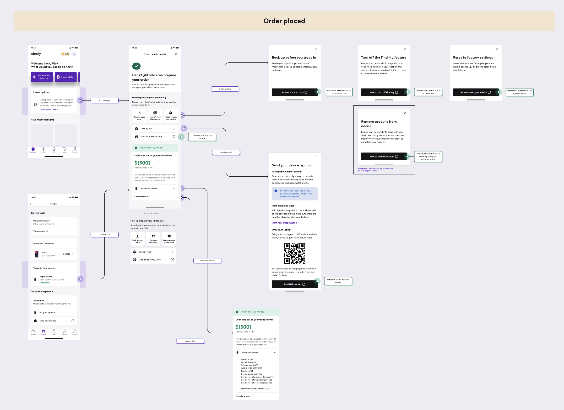
In collaboration with a UX designer, we created a temporary dashboard for users to follow through their trade-in journey. That’s where the bulk of the information would live, but other entry points in the app allow users to follow along too.
Some of the nuances that were top of mind when making this experience:
Tracking both the old and new device. Previously, the little information Xfinity did share was about returning the old device, even though the excitement for customers is around the new device arriving. We needed a system that could account for two items in motion.
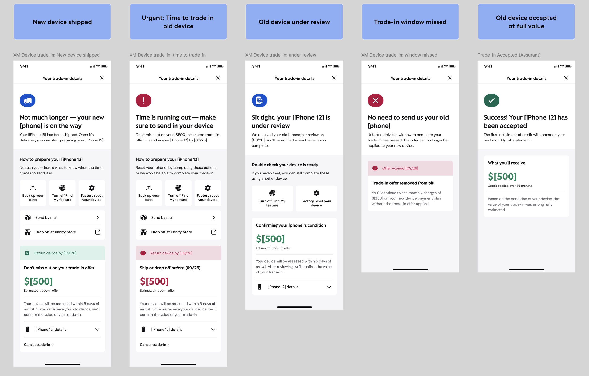
Tweaking messaging based on a customer’s mobile plan. There are four variations of the device trade-in; while we wanted the UX/content patterns to stay the same, copy had to change based on the “rules” of each type.
Using dynamic messaging. To reduce cognitive overload and confusion between the two devices, we personalized messaging for preparation articles relating to a user’s specific device, as well as addressing the new & old device by brand and model when needed.
Following progressive disclosure to identify what needs to be said on the dashboard vs. other touchpoints
Relying heavily on content hierarchy and modular design to determine what a user needs to see in what moment in time across 20+ states.
Collaborating with a third party insurance company. In order for users to receive credit, their device has to be reviewed by a third party. We had to capture this review process as well as have all copy approved by their legal team (as well as Comcast’s internal legal team).
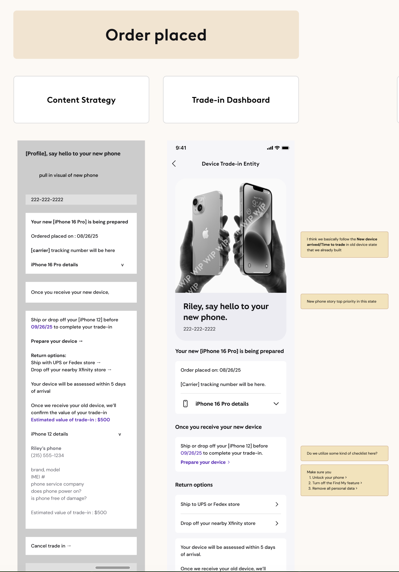
We worked through each state, documenting how our content should be structured and what a user would need to see in that moment.
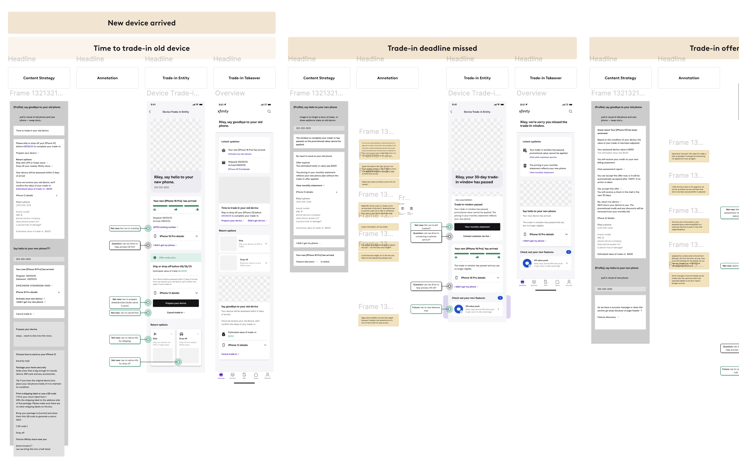
As we developed the dashboard, we also plotted the other touchpoints in the app, as well as designing content a level deeper in the dashboard.
We thought, how can a user quickly know their status without having to go into the dashboard? What information will they need to send in their old device? How can we set their expectations before sending them to an external article with their specific device’s instructions?
Examples of some of the dashboards throughout the journey
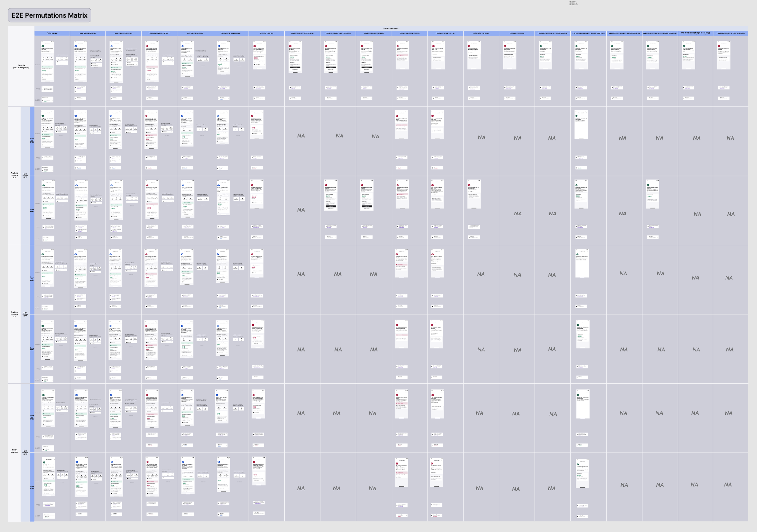
Lastly — in addition to specs — the matrix allowed me, Design, Product, and Dev to keep track of how messaging would change across states and types of trade-in offers.